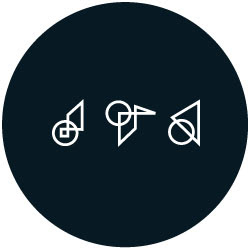
Mary Van Den Broek - Brand Identity
I was approached by Mary to create a a brand identity to be used across various platfoms for her sculpting business.
Mary's work has a strong focus around play, numbers and communication, so with this in mind I created a logo that not only resembles the angular shapes and forms that often appear in her work, but also pays homage to the Roman numeral system, something that also appears in her work. The logo is a combination her initials MVDB and also various forms of I, V, X, L, C, D and M from the Roman Numeral System. The colour palette chosen was purposefully neutral (blue/grey/ivory) depicting the natural environment in which her work is best viewed.
Design elements included business cards, brand colours, letterhead, website and leather apron stamp.
